Landing Page
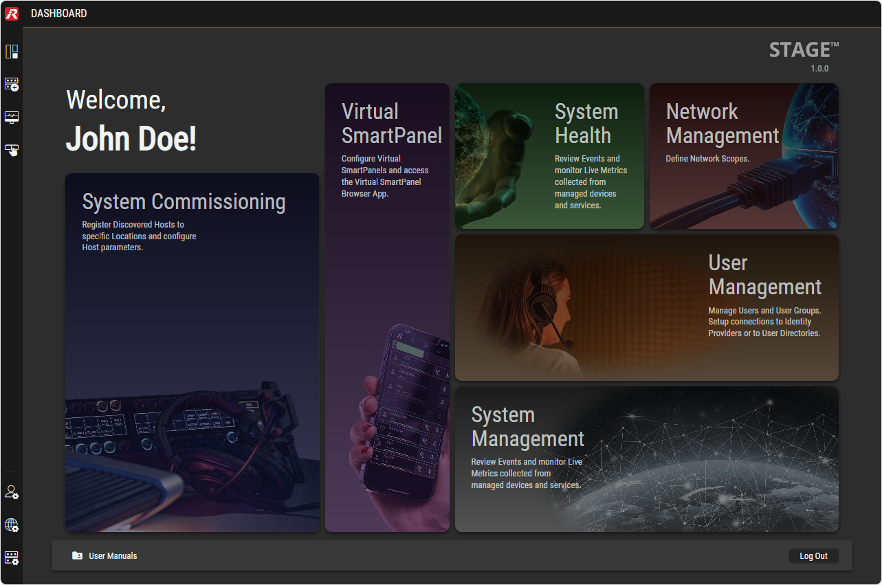
When you connect to the STAGE user interface, the Dashboard appears. This view contains links to the most important Views of the STAGE user interface.
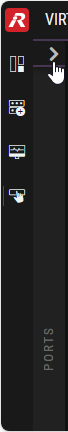
Menu
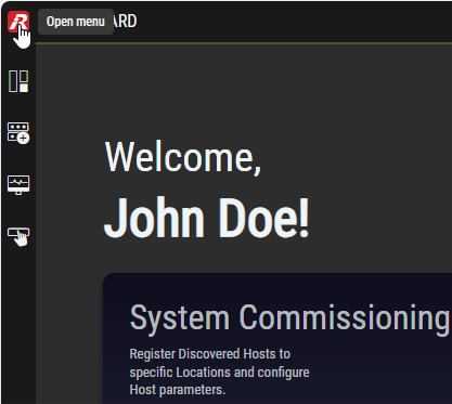
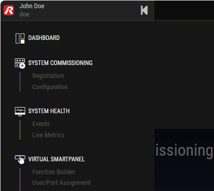
The Menu allows you to switch to all available STAGE user interface views.
This menu is displayed on the left-hand side and is collapsed by default. To view all menu items, click on the Riedel logo at the top.
A description of the individual views can be found in chapter Views.
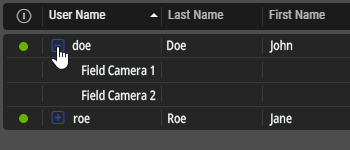
Showing/Hiding of grouped Elements
Grouped elements can be recognized by the
plus 
Clicking on a plus symbol expands all elements in this group.
Clicking on a minus 
Collapsing/Expanding Column Sections
You can recognize column sections by the right 
Clicking on an arrow expands or collapses the column section.
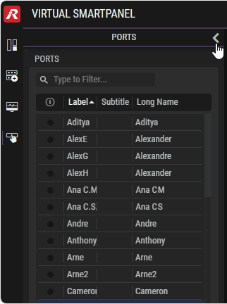
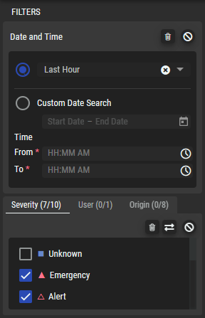
Filtering
Filters allow you to focus on pertinent content, which is useful when encountering information-heavy lists and tables.
Depending on the selected view, filters are available at the top of tables and/or in an expandable column on the left-hand side.
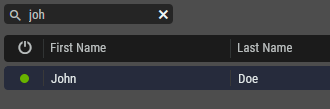
Filters on the Top
Enter characters in the text field above the desired table.
Only content containing the search text are displayed in corresponding tables (case-insensitive).
Click 
Filters on the Left-hand Side
Depending on the selected view, various filters are available in subsections and/or tabs.
The symbols at the top enable the following functions:
|
|
Click to clear all tick marks. |
|---|---|
|
|
Click to toggles all tick marks. |
|
|
Click to disable the respective filter. |
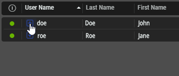
Sorting
Table content can be sorted by clicking a column heading. Click again to sort in the opposite direction. Multiple sorting is possible by holding the CTRL or SHIFT on the keyboards while clicking again on another column heading.
Selecting Items in a List
Single Selection
Single entries can be selected / deselected by click on it once.
Multiple Selection
In a table, where multiple selection is allowed, you can use the CTRL and SHIFT keys while clicking on items to expand the selection to two or more items. The two methods can be combined where you first SHIFT-select a range and then use CTRL-select to further add or remove items to or from the selection.
Enable / Disable Toggle Switches
The enable / disable switches turn a feature on or off.
|
Disabled |
Enabled |
Description |
|---|---|---|
|
|
|
Click to toggle a feature on or off. Once you have changed this setting, you must click Apply/Save to activate the change. |
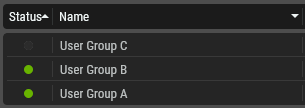
Status Indicators and General Buttons
Status indicators report the health or availability of a:
-
Parameter as to whether it is within acceptable operating limits.
-
Link or signal as to whether it is present and available for use.
-
Software option.
Cautions and warnings are a range of alerts concerning the current operational status.
Status indicators show their current status through color coded icons.
Some icons are used as buttons to accept or reject changes.
|
Status Indicators |
||
|---|---|---|
|
Online |
|
The status means: device is online, sufficient resources available or user is logged in, for example. |
|
Offline |
|
The status means: device is offline or the user is not logged in, for example. |
|
Error Emergency |
|
The status means: device is reporting an error or insufficient resources, for example. The software has become unstable. |
|
Alert |
|
Immediate action is required. |
|
Critical |
|
An error that cannot be be ignored. |
|
Warning |
|
A potential problem or condition that might lead to a fault condition. |
|
Informational |
|
A status message to provide feedback about a process or action without indicating a problem or requiring you to intervene. |
|
Warning |
|
The status means: device reports an error, for example. |
|
Yes / No |
|
The value is true or false. |
|
Rotating Green Dot |
|
The status is: a long operation is in progress. |
|
Rotating Blue Dot |
|
The status is: Evaluating or Connecting. |
|
General Buttons |
||
|---|---|---|
|
Settings |
|
Click to open a settings window. |
|
Tick |
|
The entry is selected (activated, switched on) or not selected (deactivated/switched off). |
|
Garbage Bin |
|
Click to discard changed settings. |
|
Delete |
|
Click to delete a resource. |
|
Toggle Selection |
|
Click to toggle the selection of all items. Selected items become de-selected and de-selected items become selected. |
|
Question mark |
|
Moving the mouse pointer over the question mark displays a short tooltip about this parameter. |
|
Expand / Collapse Branch |
|
Click these icons to expand or collapse a branch in a tree list. |
|
Collapse / Expand Column |
|
Click to collapse/expand a column. |
|
Hide / Show |
|
Click to hide/show the selected device. |
|
Add Item |
|
Click to add an item to a list such as a device or location. |
|
Filter |
|
Type text to filter the results in a list or table. See #Filtering. |
|
Edit Item |
|
Click to open a window for managing (adding, renaming, duplicating, or deleting) the selected list item. |
|
Alphabetical Sort |
|
Click to change the sort order of the items in a table. See #Sorting. |
|
Disable Filter |
|
Click to clear any filtering action. |
|
Calendar |
|
Click to set a date or date range. |
Notifications
The software generates notifications when:
-
There is a failure to execute an action that you have requested.
-
The software has status feedback for you.
Notifications are cards that descend from the upper right hand of the screen. To close certain notifications, click Confirm. Others close on their own after a time-out.
Failed to load the diagram preview image.
Authentication Required
Page ID: 801243625
Typical Notifications shown in the upper right-hand side of the screen